A daily stream of life

Daily photos

Posts in technique
Editing a portrait in Adobe Lightroom

A couple of videos showing how I might approach a 15 minute portrait edit using only Adobe Lightroom. Image was supplied by Trish Love-Lapico. I don't usually use Lightroom for a lot of detail editing - i.e. skin and other pixel-level edits, which are more efficiently done in Photoshop. It is helpful however to see what Lightroom can offer. Shout if you have any questions.

Initial colour correction and edit

Finishing touches

Shooting into the light

Shooting into the light (also known as contre-jour) is a technique that can get you out of a sticky situation in mid-day sun, as well as being a stylish way to take a portrait. A few people have asked me about how I do it, so here it is.

Why shoot into the light?
Old boxes of film used to include a little sheet of helpful photography tips, and one of those was to always place the sun behind your (the photographer's) shoulder. Of course this makes sure your subject is well lit - but it's not usually the most flattering light. Apart from the few minutes after sunrise and before sunset, having the sun directly on your subject can lead to harsh, contrasty lighting - which isn't usually the best for portraits.

This harsh light can be avoided by moving to the shade - or placing something else between the sun and your subject to diffuse the sunlight, such as a pop-up handheld diffuser. Flash-fill is another option. An alternative is to turn your subject around, so their face is in shadow and you are shooting directly into the sun. Now, the most important feature of your portrait no longer is lit by the bright and contrasty sunlight.

Try placing the sun in different areas of the frame - sometimes it works best outside of the frame altogether, other times it looks better placed in the corner of the frame. Trial and error is the way to go. It can be effective if you get the sun just peeking through from behind your subject. Also try shutting down your aperture a bit (e.g. f8 or f16) - this will give the light source have a star-like quality as it comes into the frame.

Shooting contre-jour does mean that you need to know a few tricks to get the exposure right, because you camera can get confused by this type of lighting.

Camera settings
It's probably unfair to say the camera is confused - the exposure meter within it just keeps on doing what it always does. The important thing to remember is when the camera sets an exposure value (f-stop/shutter speed combination), it tries to make the image an average (18% grey) brightness. It doesn't know which part of the frame is important to you.

If your frame has an evenly lit background of similar brightness to the subject (e.g. when you shoot with the sun over your shoulder) then the camera gets it right off the ball. If you shoot into the sun however, there is a huge difference between the area you want to be the correct exposure (your subject) and the rest of the frame behind, which is vastly brighter. Since the camera doesn't know what's important to you, it averages the exposure out, making your subject way too dark. See the image of Camille below - the sun coming from behind and the bright background has made her face too dark.

Aperture priority, standard metering

Aperture priority, standard metering

Once you know that you are shooting in a situation where this is likely to happen, you can override the camera's automatic exposure settings and make allowances for it. If you shoot on any mode but manual, all this means is setting the exposure compensation on your camera to 1.5-2.0 stops over-exposure (+1.5-2.0). All cameras with manual settings will have an exposure compensation option, and for me, this is the most important function you can learn to use once you get off Auto.

Basically, you are saying to the camera - 'Here's the scene, I know you're going to be confused by the light behind my subject, please add a couple of extra stops of light to allow for this.' Don't forget to change the exposure compensation setting back to 0 afterwards, or all your next photos will be over-exposed!

Aperture priority, +2 stops exposure compensation

Aperture priority, +2 stops exposure compensation

When you first see your image, it might look quite washed out with little contrast, but don't worry that's normal and it will be fixed afterwards when you get home :) If you're still worried, shoot a few more with exposures either side - it's always good to have options! The other thing you can do is to use a reflector to bring some light back into your subject's face. This usually means another person and more equipment and I've found that it's not usually necessary if you're shooting raw files - the information you need is usually there for most situations.

Post-production
When you come to load the image into your computer, you will find that the histogram in your image editing program looks a bit like this:

histo1.jpg

Basically, it's pushed over to the right, indicating a bright image. The histogram will have 'spiked' on the far right, meaning that you have pure white areas in the image with no information at all (also called 'blown out highlights') - don't worry, that's just the sun or the brightest areas around your subject.

The other thing to note is the big gap at the left of the histogram. This means no areas in your image are black. You can correct this and bring back some contrast by using your software to shift the left edge of the graph closer to the edge of the histogram frame. How it's done depends on your software. In Lightroom or Adobe Camera Raw/Photoshop you drag the 'Blacks' slider to the left. In other programs you can use a 'Levels' adjustment and drag the slider at the bottom left in the same direction. This makes the darkest areas of your image a bit darker and brings back contrast, removing some of that 'washed out' look. But don't overdo it, that look is part of the style of contre-jour! Be careful using 'Exposure' or 'Brightness' settings to do this, or you will lose the light in the subject's face.

If the highlights are too bright, then you can use the 'Recovery' and 'Exposure' sliders to bring back some detail.

An alternative approach - silhouette
In the photograph below, I made a different decision when shooting - I knew that the camera would be tricked by the sun and make the subjects dark. This time however I didn't use exposure compensation because I wanted exactly the result I knew the camera would produce - a silhouette in the frame. I wasn't interested in subject detail, just their outline.

Summary
Shoot with your camera set to capture raw files if possible - you need as much information as possible for post-production

Shoot on aperture priority, with your standard exposure metering

  • Set exposure compensation to +1.5 or +2.0
  • Bring back the detail in the blacks in post
How do I make my images clear & crisp?

I recently had the above question on an image on my Facebook page and I think it's a great one. I certainly remember wondering how some people managed to get such super looking images when mine always seemed a bit lacklustre. As with most things technical, there isn't a single answer to this, but these are some of the principles I've learnt that improve image clarity.

There are 3 main areas:

  1. Capture the best quality image possible
  2. Use editing techniques that preserve the integrity of your image
  3. Optimise your image for desired use: sharpening & sizing

I'm going to break each area down a bit and discuss separately.

1. Capture the best quality image possible

Raw not JPG
It goes without saying that in general the better quality the camera you use, the cleaner and better image quality you can expect, but I think it's wrong to assume you can't create clear, sharp images with any modern dSLR or compact camera. Sure, if you're going to be blowing them up to a huge size then you'll need a medium format camera or similar to get the resolution needed, but here I'm talking about web or average size print output.

Whatever camera you use, you need to make sure you capture the most data possible with each shot. Where possible, this means shooting in Raw format, if your camera has the option. In short, Raw format keeps all the information from the camera at each capture, whereas .jpg modes discard about 80% of the data, after the camera has made it's decisions about how the image should look. Having as much data as possible from a capture means you have more to play with later if you wish to optimise or creatively edit it in an image editing program such as Photoshop. I'm going to use the term 'Photoshop' for image editing program from here on, just because that's what I use.

If you don't have Raw, then shoot the highest quality and resolution mode possible. And next time you upgrade, look for a camera with Raw support - even many compacts have it now.

Better lenses?
Sure, you are going to get sharper, clearer images from professional-range lenses. But this is most important if you aren't going to be editing them afterwards and they're destined for immediate use (e.g. using .jpg capture mode). If you edit your images in Photoshop then you can improve them to nearly match the sharpness and contrast that comes out-of-camera with more expensive lenses. Expensive lenses offer you more than just better sharpness and contrast, so it's not the whole story of course.

Correct exposure (or slight overexposure)
A correctly exposed image always looks better than one you've had to 'rescue' in Photoshop. Getting accurately exposed images comes with time and experience shooting. An accurately exposed image is one where there is a full range of brightness levels in the file at the time of capture. The 'range' that you need will depend on the style and creative decisions you make for your picture. It is very helpful to understand histograms when learning about exposure. Figure 1 shows the histogram of an image that is underexposed. There is no information at the right or  highlight end of the curve.

Figure 1 - underexposed

Figure 1 - underexposed

A properly exposed image generally has an even spread of the graph from left (dark tones) to right (bright tones). This is a slight oversimplification, but let's run with it for now for the sake of this discussion.

Digital camera sensors capture a whole range of information about your images - details of structure, light, shadow and colour. It is very important to understand that the most information is captured in the brightest stop of the histogram. Not just information about brightness, but all the other stuff too.

The second brightest stop captures only half of all the information of the first and so on (Figure 2). Most digital SLRs can capture 8 or 9 stops of light in total.

Figure 2

Figure 2

In Figure 3, I have overlayed the other two graphs onto teach other. As you can see, by not capturing any information in the bright areas, we are effectively not using a huge proportion of the camera's sensor, and reducing greatly the amount of information available when it comes to processing later.

Figure 3

Figure 3

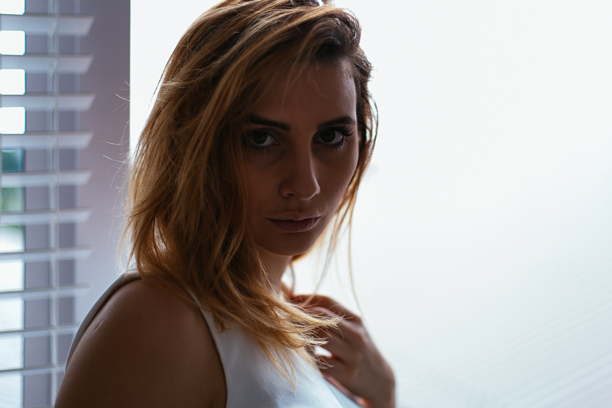
This means that when I make exposure decisions at the time of taking a photo, I generally aim to slightly over-expose an image, just to make sure that I capture as much as possible in the highlight end of the histogram. Importantly however you have to do this without blowing out the highlights. 'Blowing the highlights' means that areas of your image are so over-exposed that you have nothing but white, with no detail at all. In this situation, no attempts to pull back information later are going to work - although Raw files are much more forgiving of this than .jpg captures. Of course the image will look to bright when you start to edit it, but that's easily fixed with a couple of sliders and the overall image quality will be improved.


2. Editing techniques to preserve integrity
This includes things such as:

  1. Using non-lossy formats to save your files while working on them. Repetitive saving of a .jpg image will degrade the quality of the file. Better to use .PSD or .tif
  2. Work in the highest bit mode possible (e.g. 16 Bits/Channel rather than 8) 
  3. Do as many of your corrections in a Raw converter as possible - this gives Photoshop the best quality file to finalise the image (if you need to use Photoshop at all). Raw converters include Adobe Lightroom, Aperture and Adobe Camera Raw, which is built into Photoshop.
  4. In Photoshop, use layers when you edit - it preserves all the data from your original image, rather than removing some with each change you make on a flat image without layers.

At the time of editing you will use various techniques to improve the image such as increasing contrast, saturation or vibrance, local sharpening and/or clarity adjustments. This is an extension of your artistic vision that began at the time of taking the photograph.


3. Optimise images for desired use (output)
Images look best when they have been prepared for their final use. This means

  1. Re-sizing images to the correct size using the best method possible.
  2. Applying correct sharpening as a final step

If you are going to load images onto the web, you need to know the final size they are going to be viewed at, because they will always look better if YOU do the size conversion (and before the final sharpening step). The same goes for images destined for print.

For Facebook, for example, I know that images will only be shown at a size of maximum 2048 pixels on the long side. Therefore, I re-size and then sharpen the image myself before uploading, because I know the quality will be better if Photoshop does it, than if I feed full resolution, unsharpened images into Facebook's upload tool. Images larger than 100kB will be resized by Facebook. In practice Facebook's image algorithm is awful and it's hopeless to think you can consistently present high quality images via this website. It's worth noting that Facebook pages have photos resized to 1MB, so 10x less compression. And some believe that saving files as PNG results in better quality - I've done several tests of this and been unable to tell the difference.

Sharpening is a topic in itself, on which whole books have been written. Essentially, there are 3 stages to sharpening an image. Most dSLR images need slight sharpening before you start editing them - capture sharpening. This applies to Raw images especially - camera .jpg files will have some sharpening applied depending on your menu settings. Capture sharpening can be applied via a Raw converter or in an image editing program. You can then apply creative sharpening to the image in Photoshop - e.g. the eyes of people or other areas that you want to 'pop'. Creative sharpening is optional and most images don't need much if any at all. Finally, all images - especially after resizing - need output sharpening. The amount of output sharpening depends on the final use - less for web, more for print. 

Adobe Lightroom takes care of output resizing and sharpening for you in one step using the Export command. Other software does this too, but if you are finalising an image in Photoshop, you'll have to resize, then sharpen and finally export this Facebook version if you want the best quality file to upload.

I hope this helps explain some of the ways you can get a better quality image from what your camera delivers. Shout if you have any questions!

Predictable beauty - or in the eye of the beholder?

"Beauty is in the eye of the beholder"

Is it really? What do we understand by this statement? Presumably that we all possess different standards or interpretations of beauty. And that which one person considers beautiful will not predictably apply to another. On the surface this seems reasonable, but after deeper consideration of the evidence we find that it actually isn't true.

In terms of facial beauty, psychology research has shown us that there is wide agreement across cultures about who is beautiful. Interestingly, none of the studies found exposure to western media to have any influence on perceptions of beauty. It has been found that babies as young as only a few months old gaze preferentially, and for longer, at faces judged by adults as attractive as compared to those who are aren't.

Divine Proportions

Many believe that beauty is strongly related to facial proportions that conform to a shape as described by Divine Proportions or the Golden Ratio of 1.618.  Dr. Stephen Marquardt was one of the researchers who not only studied cross-cultural human beauty but also incorporates the principles of his research of the Golden Ratio into his maxillofacial surgery practice. He has developed a series of mathematical masks which can reliably predict human beauty and be utilised for aesthetic dentistry and surgery.

Coming to the image at the top of the page and discussion about predictable beauty, it came as no surprise to me that when I shared this on the internet it was received favourably. I have many other photos that I personally prefer, which received much less (and in many cases no) attention. Interestingly, one of my most popular photographs in the years I've posted on social media is of two horse riders at a beach in New Zealand (below)

If you are looking for other photographic features that conform to universal standards of beauty to include in your images, these will include:

  • saturated colours rather than dull
  • bright images as opposed to dark and underexposed
  • high contrast not flat
  • broad but directional lighting
  • beauty in nature - sunsets, hillsides, seascapes and long white beaches. We prefer sun rather than it's absence, images that depict warm weather, blue skies and scenes void of pollution or human spoiling of nature. These subjects often have the added benefit of inducing a 'pleasurable memory' from holidays in our lives.

Not to say these are fixed rules and there is no room for individual aesthetic taste - they are broad generalisations - you only need to look at Flickr Explore for proof of these styles however.

Compositional influence

One of the most important skills we must develop as a photographer is the ability to not only view and enjoy the images other people make, but to critically read them and think about why they work (or don't work) from an emotional and compositional point of view. Learning from this we can then apply these principles to improve our own art.

Compositionally, the image at the top of the page has foreground, mid-frame and background points of interest because I chose a wide angle lens. Wide lenses exaggerate distance and reinforce depth in an image. Compare this for example to the other horse riding image above in which composition is flattened by use of a telephoto lens. Not to say that one is right and the other is wrong - it's just an artistic choice you have to actively consider when you choose your focal length and look through the viewfinder.

In photography we utilise the Golden Ratio, although it is more widely known as the 'rule of thirds'. In general an image is considered more compositionally balanced if we place important subjects on a line that divides the image into thirds - along either the horizontal or vertical axes. In my two-horse image above the midpoint of the horses is at approximately the 1/3 from right edge horizontally. I also placed them on the right side of the frame so they have photographic space ahead of the direction they are running. Placing a subject moving or facing the frame edge tends to create an unsettling tension rather than balance. This tension can be used to create interest if done with care - in this photograph for example, the subject's gaze out of the frame makes us wonder what she is looking at, holding our attention for longer than if she were looking directly at the camera or camera right.

I took several other frames at the time of the sunrise image and have included two of them below (and the original to save scrolling).

Original image

Original image

The importance of visual weight

The first shows both Hannah and the horse aligned on their 1/3 lines - so why isn't it as pleasing from a compositional point of view? The relative size of Hannah in the foreground has much more visual weight than the beach walker in the mid-frame, so the image feels centre-heavy. A relatively dominant subject on the left foreground of the frame requires more space to the right to achieve a satisfying compositional balance. Visual weight isn't just about size, but more about what draws the eye. The human form has great visual weight, as do larger objects and those that are colourful and/or brighter.

Hannah and walker on 1/3 lines of frame

Hannah and walker on 1/3 lines of frame

Another frame below shows a different layout. Some may prefer this to the original image and although I think framing the horse more to the right leads to greater compositional balance, I preferred the position of the horses legs captured above. Also, the foreground sticks below the horse are a bit more distracting in the image below. Of course I could use Photoshop to exchange the horse from above and remove the sticks, but that would be cheating...!

The differences are small, but perhaps better appreciated in the larger versions when you click them.

A more balanced composition?

A more balanced composition?