Predictable beauty - or in the eye of the beholder?

"Beauty is in the eye of the beholder"
Is it really? What do we understand by this statement? Presumably that we all possess different standards or interpretations of beauty. And that which one person considers beautiful will not predictably apply to another. On the surface this seems reasonable, but after deeper consideration of the evidence we find that it actually isn't true.
In terms of facial beauty, psychology research has shown us that there is wide agreement across cultures about who is beautiful. Interestingly, none of the studies found exposure to western media to have any influence on perceptions of beauty. It has been found that babies as young as only a few months old gaze preferentially, and for longer, at faces judged by adults as attractive as compared to those who are aren't.
Divine Proportions
Many believe that beauty is strongly related to facial proportions that conform to a shape as described by Divine Proportions or the Golden Ratio of 1.618. Dr. Stephen Marquardt was one of the researchers who not only studied cross-cultural human beauty but also incorporates the principles of his research of the Golden Ratio into his maxillofacial surgery practice. He has developed a series of mathematical masks which can reliably predict human beauty and be utilised for aesthetic dentistry and surgery.
Coming to the image at the top of the page and discussion about predictable beauty, it came as no surprise to me that when I shared this on the internet it was received favourably. I have many other photos that I personally prefer, which received much less (and in many cases no) attention. Interestingly, one of my most popular photographs in the years I've posted on social media is of two horse riders at a beach in New Zealand (below)

If you are looking for other photographic features that conform to universal standards of beauty to include in your images, these will include:
- saturated colours rather than dull
- bright images as opposed to dark and underexposed
- high contrast not flat
- broad but directional lighting
- beauty in nature - sunsets, hillsides, seascapes and long white beaches. We prefer sun rather than it's absence, images that depict warm weather, blue skies and scenes void of pollution or human spoiling of nature. These subjects often have the added benefit of inducing a 'pleasurable memory' from holidays in our lives.
Not to say these are fixed rules and there is no room for individual aesthetic taste - they are broad generalisations - you only need to look at Flickr Explore for proof of these styles however.
Compositional influence
One of the most important skills we must develop as a photographer is the ability to not only view and enjoy the images other people make, but to critically read them and think about why they work (or don't work) from an emotional and compositional point of view. Learning from this we can then apply these principles to improve our own art.
Compositionally, the image at the top of the page has foreground, mid-frame and background points of interest because I chose a wide angle lens. Wide lenses exaggerate distance and reinforce depth in an image. Compare this for example to the other horse riding image above in which composition is flattened by use of a telephoto lens. Not to say that one is right and the other is wrong - it's just an artistic choice you have to actively consider when you choose your focal length and look through the viewfinder.
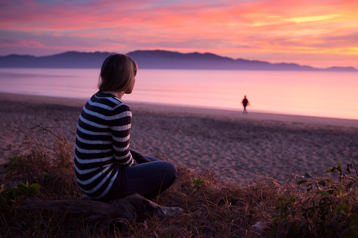
In photography we utilise the Golden Ratio, although it is more widely known as the 'rule of thirds'. In general an image is considered more compositionally balanced if we place important subjects on a line that divides the image into thirds - along either the horizontal or vertical axes. In my two-horse image above the midpoint of the horses is at approximately the 1/3 from right edge horizontally. I also placed them on the right side of the frame so they have photographic space ahead of the direction they are running. Placing a subject moving or facing the frame edge tends to create an unsettling tension rather than balance. This tension can be used to create interest if done with care - in this photograph for example, the subject's gaze out of the frame makes us wonder what she is looking at, holding our attention for longer than if she were looking directly at the camera or camera right.
I took several other frames at the time of the sunrise image and have included two of them below (and the original to save scrolling).

Original image
The importance of visual weight
The first shows both Hannah and the horse aligned on their 1/3 lines - so why isn't it as pleasing from a compositional point of view? The relative size of Hannah in the foreground has much more visual weight than the beach walker in the mid-frame, so the image feels centre-heavy. A relatively dominant subject on the left foreground of the frame requires more space to the right to achieve a satisfying compositional balance. Visual weight isn't just about size, but more about what draws the eye. The human form has great visual weight, as do larger objects and those that are colourful and/or brighter.
Hannah and walker on 1/3 lines of frame
Another frame below shows a different layout. Some may prefer this to the original image and although I think framing the horse more to the right leads to greater compositional balance, I preferred the position of the horses legs captured above. Also, the foreground sticks below the horse are a bit more distracting in the image below. Of course I could use Photoshop to exchange the horse from above and remove the sticks, but that would be cheating...!
The differences are small, but perhaps better appreciated in the larger versions when you click them.

A more balanced composition?